Saturday, April 25, 2020

new book - A child's introduction to the wonders of space


I think I finished this book in January, but it took awhile to get the photography stuff set up and then to figure out how to use my camera. For a photographer's daughter, and someone who loves pinhole photography, I am certainly bad at using cameras. This time I made notes.


(All these images enlarge) Jim and his younger brother Alan were close when they were kids. Jim has memories of making Alan laugh when he started crying. As they got older, they took different life paths, seeing each other mostly for family gatherings and holiday dinners. Alan died suddenly at 51. When we cleaned out his apartment, we were sad to realize we didn’t know him well.


A year after Alan died their mom went into residential care, so Jim and I cleaned out their childhood home. Among many other things, we found a copy of The Golden Book of Astronomy that had drawings and scribbles in it. Jim has his childhood copy, which is worn but not marked up, so this must have been Alan’s copy. Jim supposes that Alan scribbled in his book so their mom got Jim another copy, and the marked up book went to Alan.


I saved a lot of stuff when we cleared up, mostly old books and comic books. Most of the books were added to a pile of old books I keep for collage. They were mostly geology texts and some field guides. When I was making sketch books and didn’t have enough book board on hand, I thought I would use covers from some of my the old books. I don't normally make altered books, so I thought the covers wouldn't be needed.


After cutting down the cover of The Golden Book of Astronomy there was a horizontal piece left over that contained the title. Things lie ignored on my work table until I feel I must pick up. Seeing the scrap sitting there day after day made me think the long shape with the title would make a very appealing cover for a book. From there I made pages to fit the cover. The obvious content was the marks Alan made in the book and his old comics. Preserving these childhood marks makes me feel more connected to Alan. Of course I had to add a lot of collage and my own marks to the pages, but the scribbles are all Jim and Alan's.


In this last page it looks like Jim wrote his name and Alan's for Alan to trace over. Under the flap on the right hand page is just a shortened version of this blog post. It ends with "Good bye Alan - we'll look for you on the dark side of the moon."

Thursday, April 09, 2020

The Anti-Hallmark Cards


Jim and I make cards for each other for events like birthdays and anniversaries. Over the years he has often echoed whatever kind of book art project I am working on at the time. Here are a few recent cards. I love their roughness because they are so sincere. I believe that's a "28."


He is heavily influenced by all ameboid styles of art. Note the staples to hold the pop-up in place.


Jim is also an excellent grammarian.


Umpteenth might not be romantic, but we have been together a long time now. Puns and bad jokes are his mainstay.

Saturday, April 04, 2020

Free Mini Book based on Stolen Shadows


One of my goals for this year is to make some free mini zines available on my website. I had hoped to finish the new site and then reveal all these new books. But of course the website is taking longer than expected so I am putting them on my blog for now. This is a four page mini zine you can download and make yourself. Click here to download the pdf. The instructions to make the book are here.

Friday, April 03, 2020

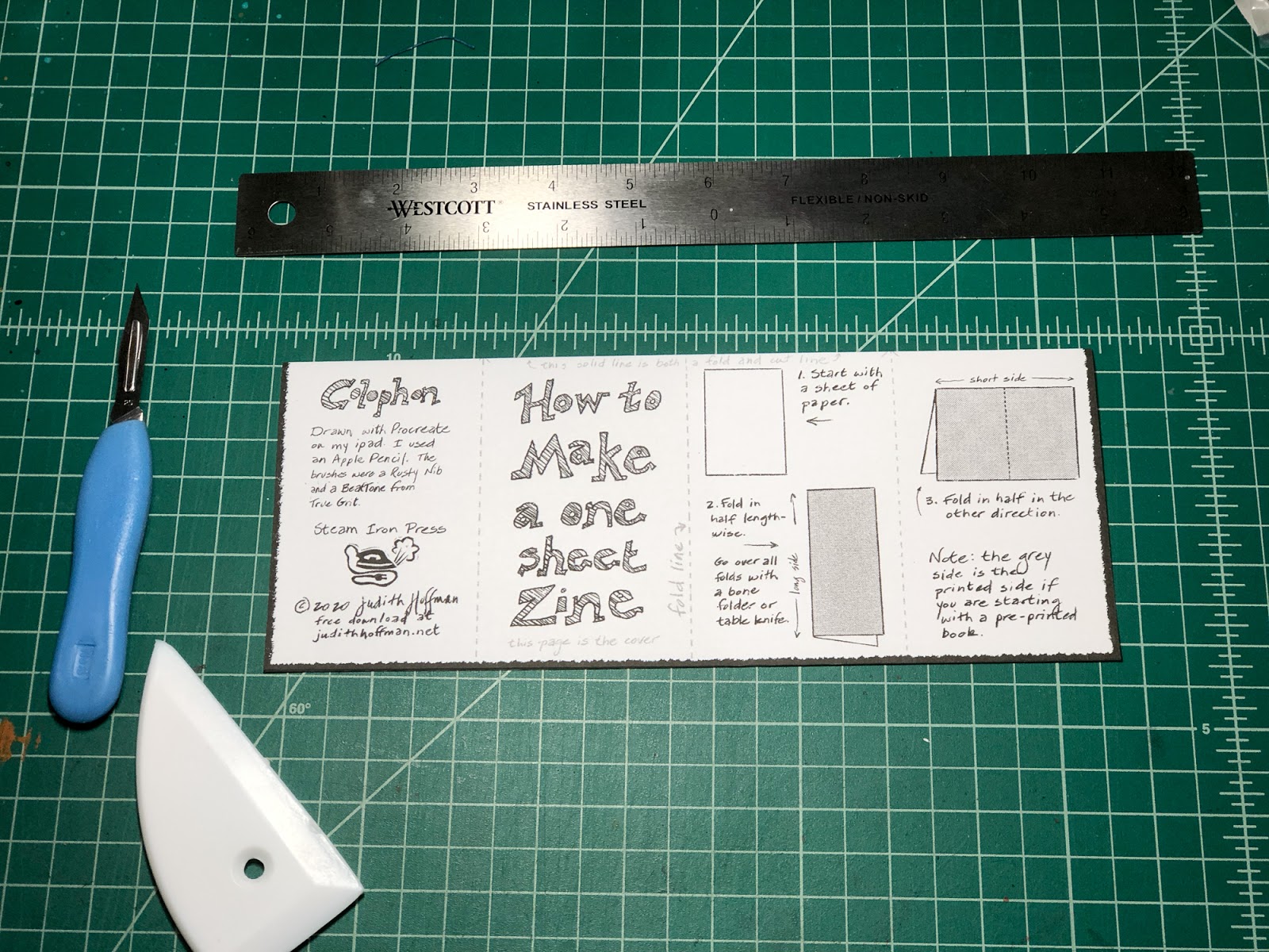
How to make a one sheet book


Here's a little book you can make that shows you how to make the little book. Download the pdf here and print. Or you can use a blank piece of paper and make your own book. Light paper like inexpensive printer paper works well. You also need a bone folder or table knife or even your thumbnail to go over the folds. And you need an exacto knife or a pair of scissors.


If you download and print a book from my blog or website, trim off the white margins. If you are starting with a plain piece of white paper you won't need to trim the margins. Note: all these images will enlarge.


Fold the paper in the long direction. For all these folds I go over the fold with a bone folder to tighten it. Is it necessary? Probably not.


Open the paper out and fold in the short direction.


Fold a short side up to the center fold.


Turn the paper over and fold the other short side to the center. Your paper makes an "M" or "W" if you look at it from the end.


Flatten your paper and find the points where the center fold crosses the folds across the short direction. You want to cut between the two points indicated with red arrows in the photo above. You can cut with a straight edge and exacto knife as I did, or fold the paper in half and cut with scissors. I like to put two small dots at the intersection of the folds to make them easier to see.


Now fold the paper the long way, with the slit you made at the top. Push the two ends together to bow out the center.


Keep pushing the ends toward each other to make an "X."


Find the front cover of your book. Fold all the pages around in a book form. Go over all folds one last time with a bone folder or the handle of a kitchen knife. If your book is blank now you are ready for the fun part.

Thursday, March 26, 2020

Stolen Shadows revealed at last

Stolen Shadows ©2018 Judith Hoffman - cover
If my search abilities and labeling are working correctly, I have not blogged about several finished books. I finished Stolen Shadows in 2018. Why is it not on my blog? Maybe I didn't have my photo set-up and was waiting for good pictures? I should blog about that some day. For a person who professes to love photography my photo knowledge is very slim.

Stolen Shadows ©2018 Judith Hoffman pp 16-17
"here we have the woman who is a  tree"

Anyway, here it is. Stolen Shadows, 2018, 4.125 x 2.875 inches. The drawings were done with a Micron pen. Coptic binding. Eco dyed watercolor paper, one-ply museum board and linen binding thread. I used some local leaves and rusty bits. There are photos of a similar eco dye process in my Flickr album, although the Flickr photos were taken in San Mateo. I am using Portland plants now. There are many instructions for eco dyeing on the internet. The ones I have seen aim to make clear leaf prints. This is not what I want. My goal is to have a shadowy, spotted, aged look. The paper reminds me a bit of old bones you would find in the forest. All the pages are cockled because of the eco dye process, so the book springs open. I really like this.

Stolen Shadows ©2018 Judith Hoffman pp 14-15
"they live in an all-white house I visit in my dreams"

The drawings are done from photos of people in my family who have died. And I included a cat because several cats have been major people in my life. I wanted them all to look "alive" in the silhouette, as if they might turn around and speak to me. Many of the captions come from my dreams, a few are found text.

Stolen Shadows ©2018 Judith Hoffman pp 2-3
"we thought we knew him but didn't know him well"

This book started when I drew a skeleton to test drawing on a piece of eco dyed paper. I had been drawing a lot of skeletons at that point so it was a no-brainer. The watercolor paper looses some of its sizing in the eco dye process so it can be a little strange to draw on. In places it's absorbent, in other places not. The linen thread also looses its waxy coating but that's easy to fix with bee's wax.

Stolen Shadows ©2018 Judith Hoffman pp 10-11
"now he is covered in little lights"

Tuesday, March 17, 2020

Still Struggling with the Web Site

©2019 Judith Hoffman - In which our main character has a revelation of wonderment

The image above is one of the final photos of a book I made last year. I will be showing you more photos here soon.

I said last year that I thought I could put together a new web site pretty quickly. Now I pay for my hubris. Years ago I made my existing site with GoLive, which of course no longer exists. It was pretty easy to use. Searching for a substitute, I tried WordPress and gave up on it. My big complaint is that they have different modules that update at different times. And they may not work with each other. So it seems I would be scrambling to keep things working smoothly periodically. I do know people who are happy with them, so take my opinion with a grain of salt.

I did also want to keep my folder structure the same so that old links would continue to work. There are many links in my blog posts that refer to my web site and there are links to my website on other people's websites and blogs. if I break those the best I can do is insert a message telling people they can search my site. That seems awkward.

After dumping WordPress I tried Dreamweaver. It's a what-you-see-is-what-you-get application. But it helps if you understand basic html and a little CSS. I had a simple site sketched out - the top layer and one or two galleries. I showed it to friends and got some good feedback, including the thought that I should be aiming for people on devices. I think that's good advice, since most people now access the web from their phone. So I started looking at other options.

One option is Other People's Pixels, recommended by a friend who likes them very much. They seem much better than WordPress. I believe Other People's Pixels takes care of updates behind the scenes, which would simplify things for me. There is a fee, although you can get a 2 week free trial. But I can't keep my same folder structure.

So I went back to looking at Dreamweaver, which has a component called Bootstrap. Apparently Bootstrap will modify your web design to fit various sized screens. Luckily we can use Lynda.com for free through our library, so I struggled through some videos that explain all this. But just today I gave up. Bootstrap is not simple, you have to make adjustments and set CSS rules for every screen width. Needless to say, it's complicated.

I would at this point happily pay someone to create my web site. But I have heard such horror stories from people who went that route. Stories of months spent trying to fix a bad mistake. And ultimately I will need to add pages all the time. Every time I finish a book I want to add a page. Right now I have 3 finished books and two new little freebie zines to add. They will be on my blog soon, so you will see them before my web site viewers. So I think it's back to the simple DreamWeaver site for me. I feel it will be better than the alternatives.

My main concern is that someone told me she couldn't view my website on her phone. I think everything was too small. Which it is if you don't turn your phone sideways and enlarge what you are looking at. If any of you could try that on their phone and let me know if it doesn't work, that would be so helpful. After turning your phone sideways, to make the image rotate 45 degrees, it should be possible to enlarge by spreading your fingers on the screen. Do all phones do this? Or only some?

Monday, March 09, 2020

Caran D'ache Neocolor II Lightfast ratings

Caran D'ache lightfast test in window with southern exposure approximately April to December 2019

I have been playing with the Neocolor II water soluble crayons a little bit. They are fun, and very nice to use. I find them fairly soft and they dissolve easily in water. You can use a wet brush to take some color off the tip of the stick for small bits of color, or scribble all over a page and then apply water in selected areas. Once they have been watered down they don't smear on the paper. A solid crayon mark does smear.

In 2015 the Wild Portrait Artist blog posted this lightfastness chart (scroll down for the chart, which comes from Caran D'ache) and an interesting bit of information. It's the only information I can find online. The chart from Caran D'ache is out of date - some of those colors have been discontinued. And there are some newer ones. I don't have them all, I think there are a total of 84 colors. I got most of mine at Artist's and Craftsman Supply. I can't find a web site for the Portland stores, but here is their Facebook page.

I prefer to do my own tests, using paper I like, in this case Strathmore Imperial watercolor paper. I decided to make a quick test to put in a window with full sun exposure. I scribbled in the top area of the box and used some clean water on a watercolor brush to pull the crayon into the lower part. The right side of each column was covered with a dense paper. The top three rows are colors that are listed as fugitive. Some of those turned out to be pretty lightfast. Unfortunately I forgot to date the test. I am guessing it was in a window with sun or bright light from April to the end of December. I scanned the test on January 1, 2020, a few days after taking it out of the window. I will tell you what I see on the actual test because computer colors are so varied. The image will enlarge if clicked.

Periwinkle Blue has a very slight change, mostly in the watered down area.
Light Olive changed a tiny bit, the watered down area is a tiny bit lighter.
Olive also a bit lighter in the watered down area. It seems to change in tone from a warmish olive to a cooler olive where it fades.
Carmine is very faded in the watered down area.
Pink may have slight fading but it's almost undetectable. I may just be expecting to see fading there.
Russet may have very slight fading.
Ochre is extremely different in both areas - it goes very much to greenish yellow.
Brown has no change.
Raw Umber fades slightly in both areas - mostly apparent in the watered down section. It's still a beautiful color.
Lemon Yellow is so light it's hard to say, but I think it faded a bit in the sun.
Yellow also may have faded a tiny bit in the sun exposed side.
Orange is noticeably faded in both areas.
Salmon is a tiny bit faded.
Vermillion may be a bit faded, it's hard to say, I may have not applied the color evenly.
Scarlet seems slightly faded in the watered down area, or maybe the color wasn't even.
Purple may have a very slight change.
Lilac may have faded a bit in both the solid and the watered down areas.
Violet I believe is a bit faded in the watered down area.
Ultramarine looks okay.
Light Blue may be a bit faded in the watered down area.
Cobalt seems okay.
Turquoise is okay.
Yellow green I'm not sure about.
Emerald Green seems okay.
Malachite Green maybe be a bit faded but I may not have applied the color evenly.
Prussian Blue seems fine.
Black may be faded in the watered down area or I may not have applied the color evenly.
Grey looks slightly faded to me.
Light Grey seems slightly faded in both areas.
White - I'm not sure why I tested white, maybe to fill in the last box. Can't see any change.

I would not hesitate to use any of the colors where I wasn't sure about the fading. I think in an artist's book they would be fine. The question remains how they would do in a gallery setting if displayed for a month under fluorescent lights, which can fade colors a lot. If you can accept a slight shift in darkness, where the color remains the same, I think all but the Olive, Carmine, Ochre and Orange might be okay. The question is - can you accept a slight shift over time? With collage I always feel things will change anyway. Papers can yellow, magazine colors will certainly fade. It's an inherently un-archival medium.

It was especially interesting to me that many of the supposedly fugitive colors are not bad. I always look at the grey to see what their range is. The Raw Umber is a beautiful brownish grey, the Black is very dark and dense where it's applied solid. The watered down part is pretty, a nice grey. And the Grey and Light Grey are on the cool side.