Showing posts with label The business of art. Show all posts

Friday, October 18, 2024

Writing a Meaningful Artist's Statement with Jane Davies

Fluke, 1987 artist book by Judith Hoffman.
Fluke, 1987. 7 x 5 x 1 inch closed. Collage and acrylic paint on watercolor paper.
I have been anticipating this class for months. Originally I thought I could write one really good statement and cross that off my to-do list. It's not that easy. Jane suggests a new statement for every new body of work. Or maybe every 6 months. It does make sense. As we look at what makes a good statement I realize I would need to re-write it every time my work changes. With Jane's guidance we dug into ourselves and tried to explain what was important to us about making art. It was hard work, I usually just write whatever comes into my head. I ended up with 17 pages of text and notes. And three paragraphs that work well.

duck dreams artist book by Judith Hoffman made in 1987
Duck Dreams, 1987, 7 x 5 x 1 inch closed. Collage on watercolor paper, acrylic paint.
At one point I went back and looked at all my earliest books to try to explain why the book format was so important to me. I think my interest in artist's books goes way back to a text book for an art class I took around 1965. There was a photo of a handmade book that had a glove stitched to one page and a ladder on the opposite page. This whole book as a revelation - it had a lot of art that I would not have defined as art. And I loved a lot of it. It was eye opening. I figured out which book it was and ordered a used copy. I'm very curious to see that again. 
In My Dreams We Travel in Boats by Judith Hoffman made in 2008.
In My Dreams We Travel in Boats, 2008.
So far I have 17 pages of rumination. Out of that has come a statement that feels authentic to me, it's certainly the best one I have ever written. I have learned more about myself, and I know more now about what I want to say in my art. I would definitely recommend this class to people who are willing to put in the work. It's like a college level class, with time consuming homework. But it only lasted 5 weeks, with more time to discuss for another 3 weeks. The more time and effort you put in, the more you will get out of it. 

Artists book title Fluke by Judith Hoffman made in 1987.
Fluke, 1987, 7 x 5 x 1 inch closed. One of my favorite early books.
I wanted to take the time to look closely at everyone else's work and writing and try to respond to it. Partly because I don't feel I'm very good at looking at art in general. And I'm often not able to articulate what I feel about it. As people's statements came into focus they helped me to see their art in a new light. I had never realized how important and helpful a good statement could be.

And here is the statement:
Dreams have been a major interest all my life. When I was around eight I had a dream that terrified me. Little creatures were quickly lifting me up in the air, my family was far below, calling and reaching up to me. But the creatures carried me higher and higher, I couldn’t get away. I woke terrified, I had the feeling that dreaming was another world, as real as our “waking” world. I did not want to go back there for months.

I have kept a dream journal off and on since I was in my 20’s. When I went to art school in my 30’s I became consistent, and started using the dreams as inspiration. When I’m dreaming I can draw aside a curtain in my mind and see more of what’s going on there. I don’t understand most of my dreams. I always write them in the first person present tense and end with “I wake.” 

Books hold stories and are the perfect containers for dreams. They can be held in my hand, pages are turned, the images are sequential and so influence each other more. Books feel personal. I believe books can contain answers to all the big questions, where did I come from when I was born? Where will I go when I die? I just have to find or make the right book.

Thursday, April 14, 2022

My hubris bites me in the rear

Judith Hoffman web site at judithhoffman.art
My shiny new web site at judithhoffman.art

Many years ago the software I used to make my original web site got eaten up by Adobe and then stopped working under new operating systems. I couldn't add pages or edit. Several years ago I said I could whip out a new web site with Dreamweaver. Easy peasy I thought. And Bob's your uncle. And other simplistic thoughts. I got a basic skeleton together and then a bunch of other stuff happened, I didn't work on the web site. It has been chaotic around here for years, but that's not a good excuse. I just didn't work on the web site. I did finally decide I had to finish it or give up on it. So here it is, updated, larger images, fairly easy for me to add to. I will be tweaking it for awhile, but the new url has been active for years. I was worried persistent people would find it in a search and think I had no viable web presence. A main page and 6 images with bad links is not a good look. 

previous web site Judith Hoffman artist's books
My previous web site, at judithhoffman.net It served me well for years. I am tired of the color though.

Note the new url is .art. So it's judithhoffman.art. The old site is still here at judithhoffman.net. Soon I will transfer all the new stuff over. So both urls will work, they will look the same and both be up-to-date. The .art site is sort of a vanity I guess. It seems like the appropriate url for an artist, but is redundant for me. Still I feel extremely pleased to have it.

I have made some changes. The organization is different. I may leave out some of the metal work since I'm not doing that anymore. The Open Studios pages might go, I'm not doing that now. Maybe I will in the future? I  am waffling on keeping the tutorials - most aren't very relevant any more. I do rather like the pinhole camera tutorial though. I'm also waffling on whether or not I should add a section for the drawings. Since some of my drawings go into books, I don't think of my drawings as finished art. But many will never be in books. And I am pleased with some of them.

The best part of doing this - other than learning a little html and CSS - is that while looking at the photos and thinking about how and why I made this stuff, I am inspired to make so many new things. Most will probably not become reality, but it's so nice to see that some of my old projects still have life in them.

Note: The little gadget at the right where you put your email address to subscribe is possibly not working any more. It was supposed to be discontinued last year, but as of January it worked for me. If you want to be sure to be subscribed, email me a judithDOTzDOThoffmanATgmailDOTcom. I will send a notification only when I post, I won't share your email address.

Tuesday, January 28, 2020

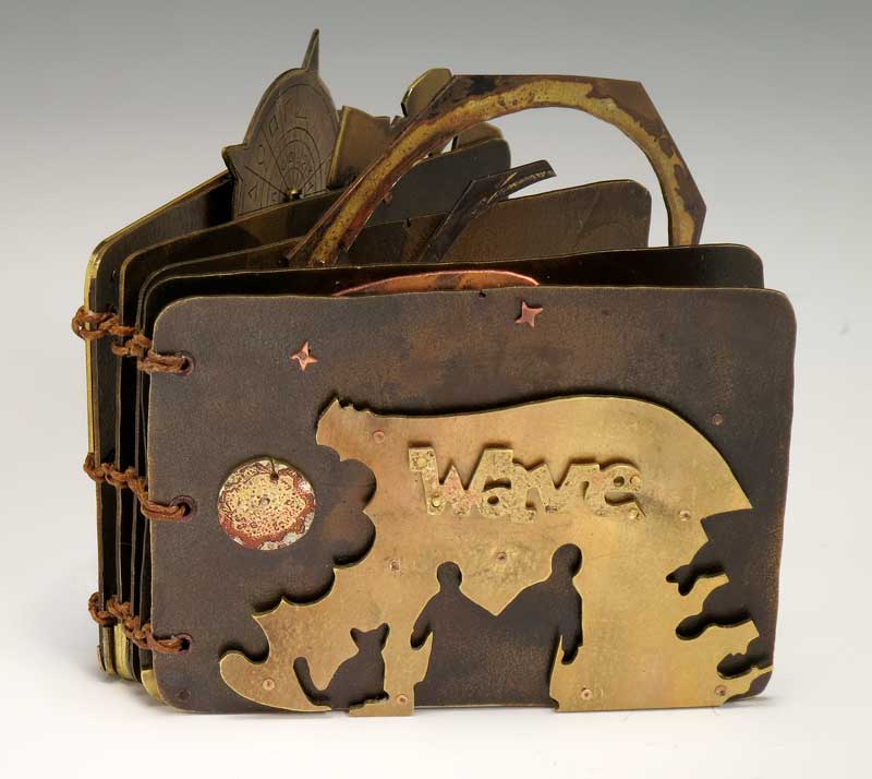
Wave has been purchased

Front cover of Wave, artist's book by Judith Hoffman. Brass and copper.

Here is some excellent news. Last week the Swarthmore library contacted me to purchase Wave. It will be in a show of paperless books next month.

Pages 6 and 7 of Wave, by Judith Hoffman. 

I am so pleased. Wave is one of my favorite metal books. All the parts except for the pages and three little stars came out of my scrap box. Many of the parts got some kind of patina before being riveted to the page.

Back cover of Wave by Judith Hoffman.

And a side note - I finally figured out how to add captions to photos in Blogger. It's extremely easy when you know how. In Compose mode when you click on the image "add caption" is one of the options. It pays to look these things up.

Thursday, March 29, 2012

Thinking Ahead

Above: visitors during our Open Studios 2011.

Studio 19 (myself and the Zymoglyphic Museum) will be open all three weekends during Open Studios this year. The dates are May 5 & 6, 12 & 13, 19 & 20, from 11 to 5.

When I mail my work to shows, I don't get to hear people's comments very often. Actually talking to someone in person about what they see when they look at my work is so valuable. Even "oh my!" or "I'd like to get inside your head" provides valuable "fuel" that can keep me going in those dark days when I feel discouraged. And "This one doesn't work for me" also makes me think about why? Did I overlook something? Could I have done better? Or maybe it's their preference for a certain technique or material?

I recently had some good feedback from Alicia Bailey, of Abecedarian gallery, on In My Dreams We Travel in Boats. In her blog she said it had "a solidity of weight quite at odds with its subject." This made me think, again, about materials, goals for my work, how to distance myself from the process and see the bigger picture. I don't necessarily have answers, but it's good to be reminded to constantly consider these things.

All this is just to say that my primary goal in doing Open Studios is not selling things - it's contact with people and seeing the work through other eyes that makes the time and effort feel worthwhile.

To read a similar idea about the benefits of showing your work - and being able to talk to people about it - check out Alyson Stanfield's article on why exhibiting your art is good for you. She says "exhibiting your art allows you to have a dialogue with people about the work. You can’t help but learn and grow from these experiences."

Tuesday, September 02, 2008

What criteria do you use for entering competitions?

Recently I asked members of the Bay Area Book Artists mailing list about criteria they use to apply to exhibits. I recently applied to several shows, and didn't get in. When I was doing metalwork, I felt pretty good at picking shows to apply to. I certainly did get turned down plenty, but I had a sense of which shows would be likely. I knew for example that words like "elegant" or "refined" ruled out my work.

Below are some comments that I received from BABA members. If you would like to add anything, you can leave a comment, or email me at artATjudithhoffman.net. (change the "AT" to the symbol.) I'd love to hear more ideas.

from Karen Koshgarian:
"After years of exhibiting, I've concluded that taking rejection personally doesn't serve me well. Unfortunately, the opposite is also true. Being included doesn't mean the work is sensational either, but sometimes fits with the "story" of the show.

"Case in point: I was included in the recent Lark publication 500 Handmade Books. The particular book that was accepted did not show the interior shot that would have made the book much more understandable. By showing only the cover, which had an airplane on it, it then became a companion to the spread. The book on the opposite page also had an airplane theme. HOWEVER, my book was a sequential, shocking look at September 11. It was not meant to be a pretty picture. Something was appealing about the cover, because it was also on the inside fly and as a pull-out, I can only guess it was because I used a three dimensional form with the cover. You couldn't even tell it was an altered book, which would have made more sense with the spine showing...I used the California State Legislator's Handbook for 2001. So in this case, yes it's nice to be in such a collection, but I can't make any meaning out of that, and still be sane!"

from Kay Hille-Hatten:
"From my observation curators putting shows together have a general idea or vision of the show, then when the applications come in they look at what they have and develop the look of the show. Artists with high quality work don't always get in because they end up not fitting into the "look" of the show. It can be frustrating both from a creative and financial point of view. When I've subsequently seen shows I was rejected from, I could tell what I had submitted didn't fit the look (of the show). I'm not sure this helps but it eased my frustration some when I realized what was happening."

from Conni Rizzuto:
"There is really no way to predict what may be accepted into an exhibit.
Selecting an exhibition that provides specific criteria that will be used to judge the books is a definite advantage. Knowing who will be doing the jurying also helps-- are they traditionalists, or do they open to artworks that test the boundaries of 'bookness'? Sometimes jurors will reject artworks because several similar ones were submitted.

"If there are 300-400 entries, only 10-20% of the entries may make it into a show. So having an idea of how many entries there have been in the past shows will give you some idea about the extent of the competition. You might find this on the gallery's web site in a press release or a blog about a previous exhibition. If not, call the galley and ask.

"One of the things that I do is look at the sponsor's web site to view the 'selected artwork' from previous exhibits. This gives me a fairly good indication of what the standards for selection might be.

"Finally, I usually try to name my artwork so that it is related to the theme of the exhibition. I make sure that my statement about the artwork clearly indicates its relationship to the theme."

from Dorit Elisha:
"What I have done in the past is create a specific piece for that show when I saw an interesting theme or challenge. If it wasn't accepted I didn't care. I was happy to have gone through the process. I guess it's kinda getting in through the back door."

from Lark Burkhart:
"It does seem as if it's a case of reading between the lines. I applied to the San Diego show too, and because I know the Atheneum tends to show more traditional work and also that there's a strong link between printmaking and book arts in the San Diego book arts community I submitted 3 of my codex-type books, 2 of which featured monotypes. And 2 were accepted."

The question of paying to show your work was also raised. Artists already pay for the photography, the shipping, and other related costs. I met an artist years ago who said he just quit entering shows. At that point in time he was known enough to be getting invitations to museum group shows, like the Craft and Folk Art Museum. And of course he had a lot more time to spend making art.

On a related note, Hariette Estel Berman has professional guidelines here. The most relevant article is "Top Ten Tips for Getting Into a Juried Exhibition, Show, Book or Magazine." Hariette includes instructions to make a contact sheet in Photoshop to accompany digital images.