Monday, March 09, 2020

Caran D'ache Neocolor II Lightfast ratings

Caran D'ache lightfast test in window with southern exposure approximately April to December 2019

I have been playing with the Neocolor II water soluble crayons a little bit. They are fun, and very nice to use. I find them fairly soft and they dissolve easily in water. You can use a wet brush to take some color off the tip of the stick for small bits of color, or scribble all over a page and then apply water in selected areas. Once they have been watered down they don't smear on the paper. A solid crayon mark does smear.

In 2015 the Wild Portrait Artist blog posted this lightfastness chart (scroll down for the chart, which comes from Caran D'ache) and an interesting bit of information. It's the only information I can find online. The chart from Caran D'ache is out of date - some of those colors have been discontinued. And there are some newer ones. I don't have them all, I think there are a total of 84 colors. I got most of mine at Artist's and Craftsman Supply. I can't find a web site for the Portland stores, but here is their Facebook page.

I prefer to do my own tests, using paper I like, in this case Strathmore Imperial watercolor paper. I decided to make a quick test to put in a window with full sun exposure. I scribbled in the top area of the box and used some clean water on a watercolor brush to pull the crayon into the lower part. The right side of each column was covered with a dense paper. The top three rows are colors that are listed as fugitive. Some of those turned out to be pretty lightfast. Unfortunately I forgot to date the test. I am guessing it was in a window with sun or bright light from April to the end of December. I scanned the test on January 1, 2020, a few days after taking it out of the window. I will tell you what I see on the actual test because computer colors are so varied. The image will enlarge if clicked.

Periwinkle Blue has a very slight change, mostly in the watered down area.
Light Olive changed a tiny bit, the watered down area is a tiny bit lighter.
Olive also a bit lighter in the watered down area. It seems to change in tone from a warmish olive to a cooler olive where it fades.
Carmine is very faded in the watered down area.
Pink may have slight fading but it's almost undetectable. I may just be expecting to see fading there.
Russet may have very slight fading.
Ochre is extremely different in both areas - it goes very much to greenish yellow.
Brown has no change.
Raw Umber fades slightly in both areas - mostly apparent in the watered down section. It's still a beautiful color.
Lemon Yellow is so light it's hard to say, but I think it faded a bit in the sun.
Yellow also may have faded a tiny bit in the sun exposed side.
Orange is noticeably faded in both areas.
Salmon is a tiny bit faded.
Vermillion may be a bit faded, it's hard to say, I may have not applied the color evenly.
Scarlet seems slightly faded in the watered down area, or maybe the color wasn't even.
Purple may have a very slight change.
Lilac may have faded a bit in both the solid and the watered down areas.
Violet I believe is a bit faded in the watered down area.
Ultramarine looks okay.
Light Blue may be a bit faded in the watered down area.
Cobalt seems okay.
Turquoise is okay.
Yellow green I'm not sure about.
Emerald Green seems okay.
Malachite Green maybe be a bit faded but I may not have applied the color evenly.
Prussian Blue seems fine.
Black may be faded in the watered down area or I may not have applied the color evenly.
Grey looks slightly faded to me.
Light Grey seems slightly faded in both areas.
White - I'm not sure why I tested white, maybe to fill in the last box. Can't see any change.

I would not hesitate to use any of the colors where I wasn't sure about the fading. I think in an artist's book they would be fine. The question remains how they would do in a gallery setting if displayed for a month under fluorescent lights, which can fade colors a lot. If you can accept a slight shift in darkness, where the color remains the same, I think all but the Olive, Carmine, Ochre and Orange might be okay. The question is - can you accept a slight shift over time? With collage I always feel things will change anyway. Papers can yellow, magazine colors will certainly fade. It's an inherently un-archival medium.

It was especially interesting to me that many of the supposedly fugitive colors are not bad. I always look at the grey to see what their range is. The Raw Umber is a beautiful brownish grey, the Black is very dark and dense where it's applied solid. The watered down part is pretty, a nice grey. And the Grey and Light Grey are on the cool side.

Friday, February 28, 2020

Update on Zymoglyphic Finds

I have fallen behind on the "defining Zymoglyphic" posts. I'll have to split my finds between 3 posts. These go way back, and I lost some of the originals. Sad story about changing to Dropbox and my lack of understanding.


This photo is confusing - the actual object is the diagonal piece of wood. It's about 12 inches long. I believe this was in the "potential base" category. Still, once things are in the boxes of parts, they can end up being anything.


Magnolia flower petal. They tend to be leathery and very attractive when dry. Probably not chosen because it's beautiful, more because most people won't know what it is.


Not sure what this was. It looks like cement or stone.


A particularly interesting stick. It seems weirdly symmetrical.


I suppose everyone recognizes this - a dried red pepper. I'm not sure how it passed the test - seems a little too obvious to me, but it is nicely wrinkled.


And speaking of wrinkles, here's a beauty. Neither of us remembers what this is, if we ever knew. Clearly a piece of dried up fruit. Jim says it's interesting because of the nice patina and the you-don't-know-what-it-is factor.

Monday, February 10, 2020

Looking back to look forward

Work in progress - A Child's Introduction to the Wonders of Space - title page
by Judith Hoffman 2020
Hilke Kurzke did two blog posts last month about her art life, her goals and where she feels successful. They are here and here. I think it’s a good look at what life is like for an artist. Hilke's website is here, she blogs about her message in a bottle activities here, and she sells book making supplies.

In this post I have in part responded to her blog, and in part I am just setting these things out for myself. At the end of this post, after the art categories and goals, I included my personal goals for those of you who are curious. I actually don’t usually make New Years resolutions. For me they are a path to feeling discouraged. So I’m not regarding these as resolutions, just some things I want to think about. I will try to nudge myself in this direction. This is also a good way to get clear on my priorities.

Hilke says “Being self-employed and self-taught, the lack of a pat on the shoulder by a boss or teacher can be a problem . . . while it is often easy to see where we fail, it can be harder to know where, maybe despite short-comings, we still are doing well.” I think this is true for me. There are times when I have felt I was struggling and not making progress, but looking back I was making slow progress and could have felt good about it. Of course other times I struggled into a corner and had to turn around and start over.

To define success for herself, Hilke thinks about the times when she felt successful. This is a personal part of what we do. Two artists might have very different ideas of success.

Work in progress - Judith Hoffman 2020

The times when I feel most successful are when I make a particularly quirky book or object. The moment when it’s done and I look at it on my work table can be so great - I’ve never told anyone, it seems embarrassing somehow, but sometimes I sit back and laugh. It’s a personal pat on the back. So yes, I want more of that success. There is another way I feel successful: sometimes when I finish a book I am sick of looking at it. Maybe I struggled with some problem, or it isn’t what I envisioned when I started. But months later when I take it out of the box, I see it’s good qualities. It is redeemed and I love it. More than anything, I want to feel successful and be proud of myself and my work in either way. Which means finish more books in 2020. The way to have good work is to make a lot of it. Some will be successful and some will not. I should try to not get so bogged down in small details. (I know I will, but I can nudge myself away from that.)

Other times I felt successful were when I was included in books about the book arts or in shows or in a public collection. I guess sales in themselves aren't that important to me anymore. But they can be very gratifying.

Work in progress - Judith Hoffman 2020
My art related categories and goals:

More time in the studio - I do have some spare time that could be shifted into studio time. But I don’t want to give up all my spare time. I think there are quality of life issues, and other things, like hobbies, that I want to pursue. Mostly gardening and knitting. These both give me a lot of pleasure. And a little physical reading. I listen to a lot of audible books, but reading a book on paper is a different experience. And some time to draw, which should be an art category, but fits nicely into my evening down time.

Make one-of-a-kind books - I made three last year, I’d like to make four or five this year. Although the last one is not quite finished. I need to get busy on that.

Make some multiples - Last year I wanted to enter some shows, but when I looked at the insurance requirements I couldn’t. I would have had to send a one-of-a-kind book that took me months to make off into the world with either no insurance or I would have had to insure it myself. I might do that in the future, but having multiples would take away that angst. Right now I have one book that I think would make good multiples. I need to make progress on that.

Dreaming Made Easy - free book on my website
by Judith Hoffman

Make some freebies - This is just for fun. I love having a few free things on my website. I love the playfulness of them. They do end up taking a lot of time so maybe one or two this year is a good goal.

Recognition in the book arts world - This probably means being in a few shows. To do this I need some very nice multiples, or some lower priced books. Or I need to find a show where sales are not essential. Multiples would be spin-offs from my one-of-a-kind books. Probably this would mean scanning the books, printing them and assembling them. Still a lot of work and new problems to solve. To have lower priced books I would need to make them quickly and they should be less complex. I’m not sure I can do that. I see most of my less complex work as a failure. The details are who I am, what my books are. So make a multiple and look for show opportunities where I don’t have to sell.

Part of me objects to finding value in recognition from other people. I don't want to be working in my studio thinking "will this get into a show?" But being in a show means people see my book, and maybe respond in some way to the content. It makes me very happy to just make things, and I would do it even if no one ever saw them. But having someone respond to the content is very satisfying.

Post to my blog - I love other people’s blogs. I'm not a fan of social media, although I do use it some. So I should be contributing to the blog arena, right? Besides it is a good record for me. And I do sometimes get some really good feedback. It’s good when people like the books, of course. But also good in the sense that someone will see something I missed. I find seeing things through other people’s eyes can be very helpful or can lead me to new trains of thought. I’d like to post weekly but even every other week is good. I posted 17 times last year, so a goal of 24 seems reasonable.

Work in progress - Judith Hoffman 2020
Personal things I would like to improve:

Cook more - I have a lot of food sensitivities and need to prepare all my own food.
Be less compulsive - I spent weeks of art time just on the text and paper for the last page/dedication for "A Child’s Introduction to the Wonders of Space." I tried multiple ways of presenting the text - handwritten or printed, and struggled over the wording. Writing does not come easily for me. I used to make sure my emails were well written - grammatically correct (mostly) and properly spelled. I would write one, read it over, correct, read it again. I realized I spent a lot of time on them and decided to not be so fussy. I’m better at just whipping them out, maybe I can be a little more spontaneous in other areas. Okay, maybe not in the wording area, maybe not even in the decision between handwritten and printed. But somewhere, somehow I will try to be less compulsive.
Do Yoga - even once a week is better than never. I walk 5 or six days a week for 45 to 60 minutes, don’t really want to spend more time on exercise. But I am getting stiff in places. My favorite yoga routine is 45 minutes, I should start cutting that in half, so half on Tuesday, half on Thursday.
Meditate - I used to and have fallen out of the habit. This could follow the yoga and would be painless. Maybe it could build?
House projects - do these belong on this list? We all have them. They are endless and they torment me.

Thank you Hilke for your blog posts - they made me ask myself a lot of questions and I think my priorities are more visible to me now.

Tuesday, January 28, 2020

Wave has been purchased

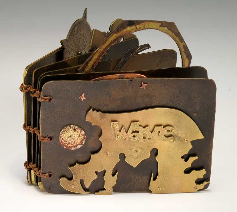
Front cover of Wave, artist's book by Judith Hoffman. Brass and copper.

Here is some excellent news. Last week the Swarthmore library contacted me to purchase Wave. It will be in a show of paperless books next month.

Pages 6 and 7 of Wave, by Judith Hoffman. 

I am so pleased. Wave is one of my favorite metal books. All the parts except for the pages and three little stars came out of my scrap box. Many of the parts got some kind of patina before being riveted to the page.

Back cover of Wave by Judith Hoffman.

And a side note - I finally figured out how to add captions to photos in Blogger. It's extremely easy when you know how. In Compose mode when you click on the image "add caption" is one of the options. It pays to look these things up.

Saturday, December 28, 2019

Year End Slump or Vacation?

I have not been blogging, or getting much done, for the last month. There were four or five days of ophthalmic migraines that set me back, a lot more than I usually have.


I started a Christmas card (above) in the middle of November, but didn't finish it until around the 10th of December. I enjoy making them, but every year I think "that's the last." I like the process at first, but when I have to make a bunch I get tired of repeating myself. The card is three layers, a kind of pop-up tunnel book. It mails flat. A friend recently said to me "we enjoyed making you and Jim 3-d." I loved that.


(photo above - the book I am currently working on. This is the title page, the book is about 20 inches wide open, and maybe four inches tall. It will be one-of-a-kind, probably never sold. It's called "A Child's Introduction to the Wonders of Space" and features parts of an old book my brother-in-law had as a kid. It was a well-loved book, he drew in it at different stages in his early life. )

Also since the middle of December, I have been feeling like every day is Saturday. It's the old holiday problem, my schedule has changed drastically. In a way I enjoy it, it is nice to laze about the house for a whole day. I have been mostly sticking with my walking schedule, that's good. But I thought I would have a bunch of free time and could make significant progress on my current project. Instead I have only spent 3 or 4 days on it in the last month. Our family Christmas dinner will happen tomorrow (Sunday). And then of course there is New Years, which means more disruption. However, I am thinking the new year will bring a better schedule.


(photo above - same book - I'm trying to solve a problem here. I don't like the composition of this page - it's actually a two page spread, you can't seem much of the left page. I need something that makes a better transition between the two pages. The blue figure isn't glued down. I will try a number of different things here.)

Luckily I don't go out a lot, I have become more and more of a hermit as I age. I do see friends as much as possible, and of course Jim is good company. But noisy parties and big events have never appealed to me. Now I figure I just don't have to do the social stuff that I don't enjoy.


(photo above - I guess I just like photos of my messy workspace. I think I have an inner teenager who doesn't like to clean her room. Progress does get made and it's helpful to have a bunch of options in my line of sight.)

I don't usually make New Years resolutions, they seem to fizzle out with a feeling of defeat by the end of January. But this year I am resolving to spend more time in the studio. I assume that's the most often made resolution for all artists. More time is all I want. I read an article recently saying "don't give up if you don't succeed at first." Good advice, it can take time to readjust to a new habit. Hopefully by spring I will be in a groove.

This post may sound negative, but I have actually been in a good mood for this time of year. And so I hope you have all had a good holiday and will have a spectacular New Year. Thank you for reading my blog. I do appreciate you all.

Monday, November 04, 2019

Do you make tests?

I think tests are important. These little booklets are where I store information about each paper. They can also lead to interesting discoveries. When I buy a new paper I like to make a little pamphlet bound book of eight or so pages. They are usually tied with a bow so I can easily take them apart later and add pages. I sometimes run a page through my printer, often paint on one to see how it holds up, then do some score and fold tests to see if the paper cracks. It's also good to draw, doodle, or test out things like rubber stamp inks, which go through a lot of papers.


An assortment of test booklets. The largest are 5.5 inches high. All images will enlarge.


Fabriano Artistico. I do like torn edges on my pages. I like the look and I prefer to not have waste if I can help it. When I tear the pages I test for grain and make a note of that. Not all web sites list the grain of paper they sell. I also make a little tearing diagram. Sometimes I note how many sheets I have although that hasn't worked so well because I forget to update that information.


Fabriano Artistico. Two layers of acrylic paint, fold tests with notes. This paper formed a few small cracks on the fold.


Fabriano Artistico. I chose this image to print because there are some very subtle areas that might not show up. There is a largish face in the lower right that is too hard to see. I could possibly increase the contrast but it might not work for low contrast images.


Fabriano Artistico. This is from a marker phase. I note the specific materials so I can see later which work and which don't.


Khadi Nepalese Tsasho Dark. I love this paper and I haven't made a book with it yet.


Khadi Nepalese Tsasho Dark. Which materials I test depend on what I'm working on at the moment, so it's a little random. I do leave extra blank pages so I can go back and try out other stuff.


Khadi Nepalese Tsasho Dark. Sometimes I just can't stop testing.

Saturday, October 26, 2019

A tour of my studio

I have been working on my website, for all of this year. One thing I want to add is a section with photos of my studio. Here are a few. I sometimes envy people who have neat beautiful studios, but I don't know if I could actually get work done in one. I used to know a woman who kept all her stuff in lovely baskets. It really was a nice place to hang out. But then could you splash paint around?
Looking in from the door. I am very lucky to have a large and small upstairs bedroom. My current space is smaller than my previous studio, so I had to make adjustments. I wish there was more light, but it's a nice space.

My current project. I have a large table to work on, but it's always covered with stuff so the working space is small. Right now I have a silicone mat under my collage area. It's very easy to wipe up PVA spills. The downside is that it's soft so I have to go to a different spot to draw or cut.

On the other side of the table there is a drawing and cutting station. I don't sit for long, I have to keep walking around the table to the other station. Which is good.

Random stuff. The red and blue books are old abandoned projects and a few books I made to experiment in. Their pages are left overs from other projects. The white pamphlets next to those books are some of my paper tests. The doll on the top shelf was from ReClaimIt. She was billed as a creepy doll. ??? Creepy must be in the eye of the beholder.

On the bottom shelf is storage for little bits of paper. Those are bamboo desk organizers. I can bring these flat boxes to my work table for projects. It's also pretty easy to sort the left overs back into the boxes because they are labeled. The cardboard boxes above hold file folders of larger paper, partly my old image file, and partly things I save for collage.

The boss sleeps under the table.

Some storage for rulers and stencils. Also cards Jim has made and various things that I love. The wooden ball hanging on the wall to the right held string in my grandmother's pantry.

Around the corner are more cards from people, and drawings by my nephews.

There is paper storage and a big desk in another small bedroom, these dinosaurs from my pinhole camera projects accumulate on the top of the paper storage.

a Pteranodon from eBay. Actually eBay is the source for all my dinosaurs and godzillas.
You can probably guess - I picked up a little bottle of high flow acrylics, and started shaking it on my way to the sink. Ooops! I forgot to close the top. There are splatters on the floor and the door too. Some day I'll have the wall paint out and will have to fix this. Or maybe it will become some thing...